
Bixdo Visual Identity
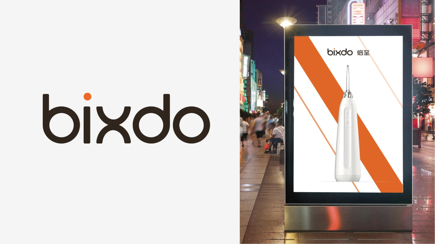
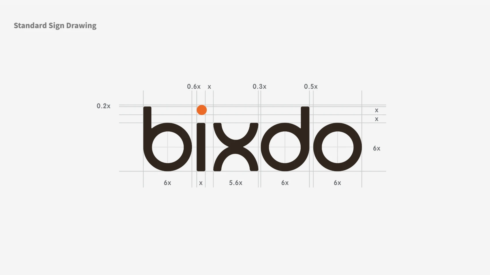
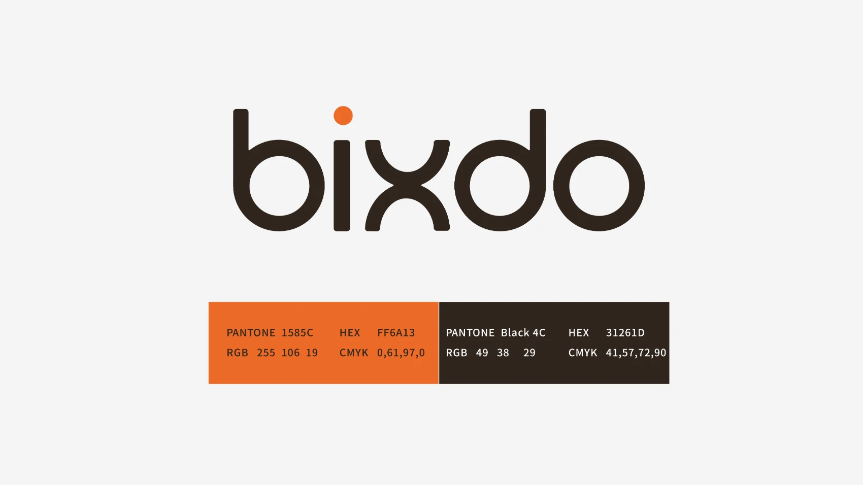
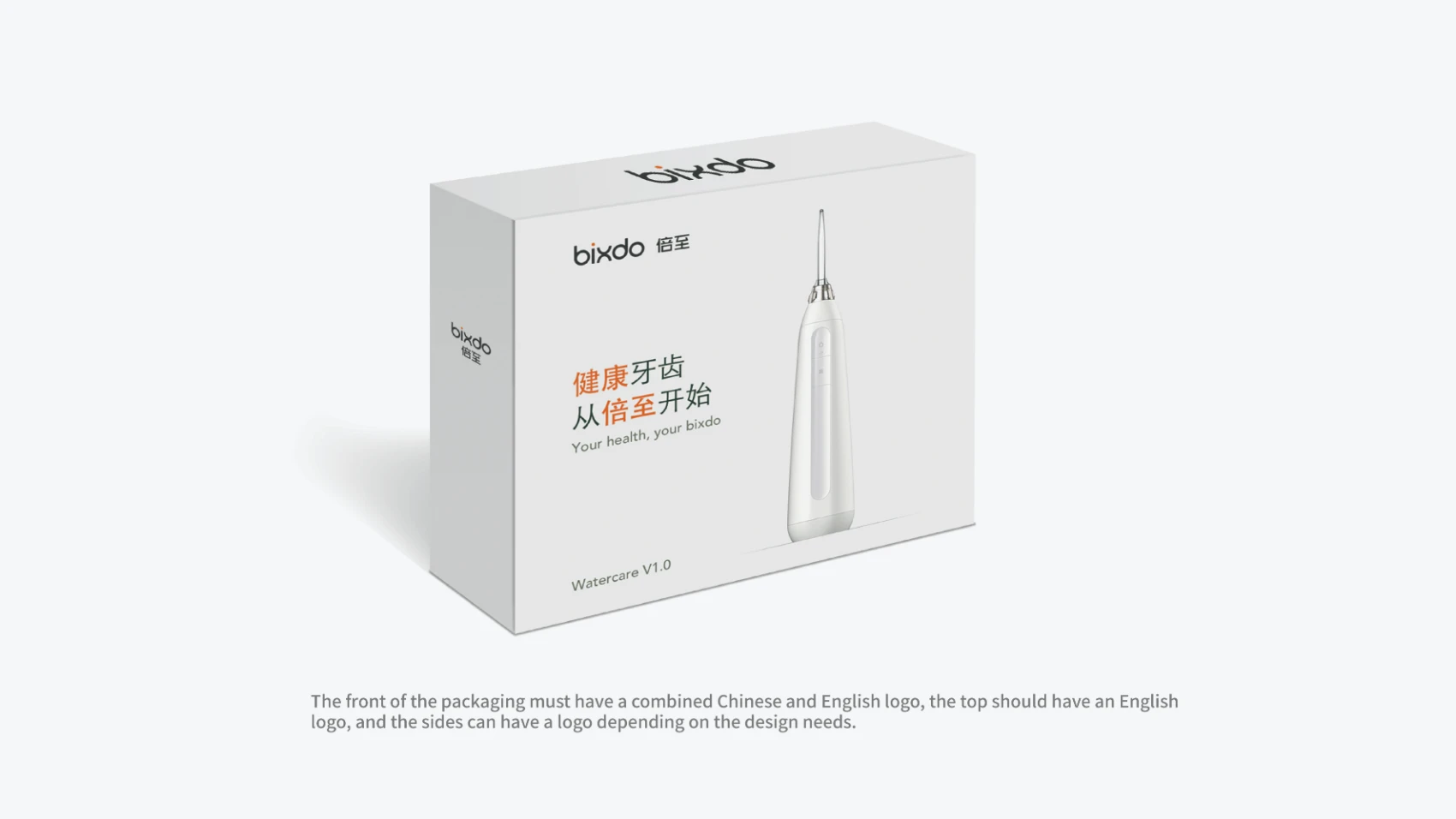
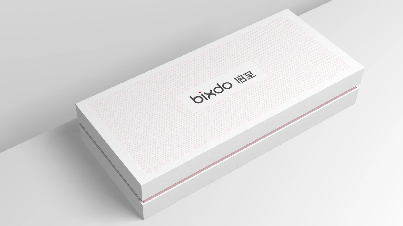
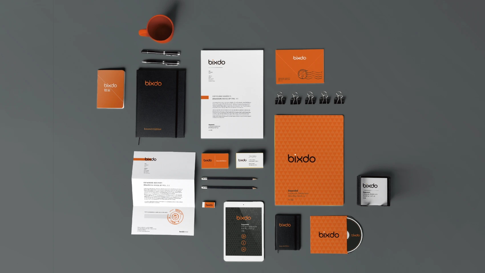
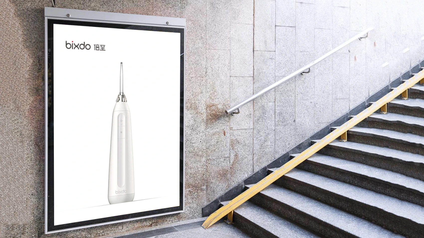
The logo mainly uses yellow and black, symbolizing a beacon on the path of promoting oral health, with the shape of the letter '1' echoing the light. At the same time, it combines innovative yet standard English fonts with standard Chinese fonts, further expressing the design concept of 'we don't create standards, we just strive for perfection.